Today's Runway My Way Friday! Today's post focuses on the house of Burberry Prorsum for Spring 2011. This collection seems loosely based on the traditional motorcycle motif that Burberry is known for. However, this collection seems to be more sexy tough, with skin tight silhouettes, shrunken fits, and tons of hardware.
I enjoyed looking at every look, because each one had something unique to offer. However, the one look I decided to recreate was Look #8
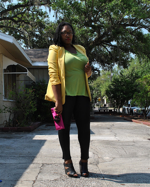
This is how my recreation turned out:
Wearing a thrifted Worthington yellow blazer, Old Navy lime green boyfriend pocket tee, Candie's black liquid leggings, Styluxe via Urbanog black cut out wedges, and a gifted fuchsia flower clutch (Thanks sis!)
As you can see, all I did was make sure I stayed within a similar color palette to the original runway look. I originally planned on wearing a lime green blazer but realized I had no yellow shirt. So, I switched the colors around and added a deep fuchsia clutch in place of the purple one in the look.
If you want to recreate this look, here are some tips for you:
1. Color blocking is very important. In this runway look, we see the color blocking trend going on with the citrus colors, as well as the punch of grape. Not everyone has a bright yellow jacket or purple clutch. To avoid going shopping, just pick three coordinating color palettes but with unique details. For example, if you have a navy blazer, wear a orange t-shirt and a red clutch. These are items that even if you have to buy them, your local thrift store can help you recreate it.
2. Keep the silhouette flattering to your body. The silhouette in the Burberry look is not necessarily flattering on me, with a cropped jacket and longer top. I have a belly and concealing it is important. So, I chose to do a longer blazer and a loose t-shirt. Because the blazer has a more fitted shape, it creates curves and helps hide my tummy.
3. You can interchange where the bright colors go and wear the dark colors go. I kept with the theme of the Burberry look with the bright colors on top and dark on the bottom half of my body. However, if you are self-conscious of bright colors, just use the shoes, clutch, and maybe a belt, hat, or bold piece of jewelry as the colorful pieces and maintain the style of the items in the runway look but in black or your dark shade of choice. Also, some people prefer bright colors on the bottom and dark on top. That's perfectly fine as well.
I cannot stress enough that when you are recreating runway looks, you have to stay true to what you like as well. I picked this look because I liked it a lot. I loved the color palette and the style. Not everyone will like this look. But you may find a different runway look you love.
Fashion is objective, but personal style is definite.
Here are some more looks from the Spring 2011 Burberry Prorsum collection that I liked
Did you enjoy the Burberry collection from Spring? Which was your favorite look or least favorite look? For more Runway My Way posts, check back here at Sarah Jane R. Styling.
Peace, Love, and Happiness!
Sarah Jane R.


Love this burberry look!!
ReplyDeleteGreat improv & advice! =]
ReplyDeleteKimberly, FWB
I am loving this one! Your clutch is a great accent to the whole outfit!
ReplyDeletexx
Love this look!!
ReplyDeleteKimberly, FWB